Browse and guides

Browse

Shop studiesGraphic clothingCustom clothingChoosing a design

Fit and care

Size guideMeasuring guideGarment detailsPrint guideCare guide

Ordering

How it worksOrderingDeliveryOrder tracking

Help

Order changesReturns and exchangesOrder problemsFAQAboutContact

Home / Choosing a design

Ink on colour

A short guide to comparing a print subject, a garment colour and where the print sits.

Veltrix / Ink and garment contrast

Ink and garment contrast

VELTRIX
PRINT STUDY
Choose two colours to compare their on-screen contrast. Fabric texture and the printing process can change the result.

The Veltrix guide / choosing a design

Find a graphic you will want to wear

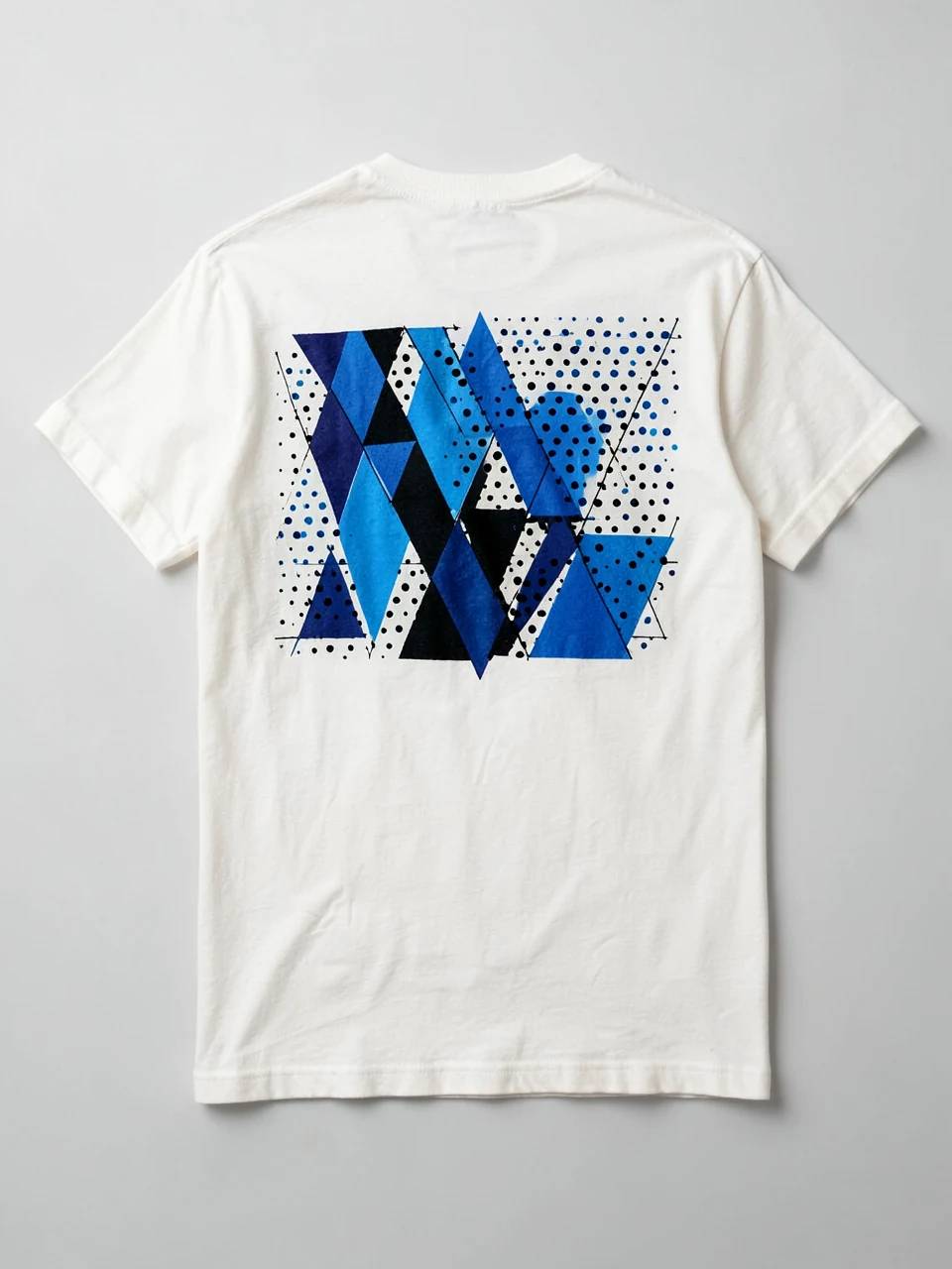
Illustrative tee back graphic study
Illustrative study
01

Compare at everyday scale

Look at a print from the distance at which another person would normally see it. Large shapes can communicate immediately, while fine line work rewards a closer view. Neither is automatically better: decide whether the graphic should be the focus of the outfit or a quieter detail. Use the colour tool to compare the relationship between ink and garment.

02

Consider the whole garment

Think about the neckline, sleeve length and layers you usually wear. A jacket can cover a back graphic; an open overshirt frames a chest print. Check both the composition and the space around it. When asking about a study, name the graphic, the garment colour and the position rather than relying on a screenshot alone.

Ask Veltrix

Still have a question?

[email protected]

Have a garment, print or order question? Open an email draft, add the details and send it from your own email app.